We have now reached the deadline, and everything is handed in. So now some time to reflect back on this year.
At the beginning of the first term I was unsure of what I wanted to do after I left university. I was always interested in working in some form within the film industry, but I could not identify what that was. I was initially asked to work on SPLAY and Polished Off to assist in the lighting and compositing aspects of the production, but these were areas that I was never entirely confident in doing. My contribution to these projects progressed throughout the year, so too had my confidence in my lighting skills.
It has been a thoroughly enjoyable experience working within the group, especially with such focussed and supportive individuals. Everyone has their niche, whether it be in animation or texturing or telling a good story. The directors have been determined to get the best they can out of their films, and their determination has given me the drive to do the best I possibly can. In addition, working on someone else's project, and not my own has prepared me slightly more for what's out there in the real world.
Lighting is my specialist area, yet I have also found a keen interest in creating textures and compositing.
I am very pleased with the way the films look. It was refreshing to finally see 8 months of work finally pieced together. It is only then you fully appreciate what it was all worth working for.
SPLAY, is as of yet, incomplete. Yes, we have created over two minutes of footage, but this is only a small section of the film. I am incredibly proud of the work that we have put into the film this term. Remember that in term 2, production on SPLAY was almost stagnant, so we have definitely turned this around, and pushed ourselves these past few weeks to get the sequence made.
It may be the end of the degree, but the show must go on. We will continue to work on the film after the degree, until it is complete. We may be way out of our depth, but nothing is worth working towards if it is going to be easy. I know we are more than capable of completing a potentially great film.
Friday, 28 May 2010
Monday, 24 May 2010
With only 4 days until the deadline, its a coincidence that I should be working on Shot 4 of Polished Off. This is a long shot of the entire hospital room, before Jed enters. In terms of lighting, everything is in darkness, apart from Ed, illuminated by the beam of moonlight through the opposite window. This shot took me a couple of hours to complete, and thankfully I used a reference from previous night lighting work on the film.
Final
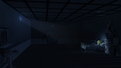
The only alterations that need to be made are to include the lights on the machine, and with an animated pump.
The light set up within Maya
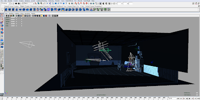
Final

The only alterations that need to be made are to include the lights on the machine, and with an animated pump.
The light set up within Maya

Sunday, 23 May 2010
It was my aim this weekend to get as many of the remaining shots composited, so that the rest of the week could be devoted to making minor tweaks and concentrating on getting the hand in folders put together for marking. I was very pleased with my progress this weekend. Here are the completed stills:
Shot 13:
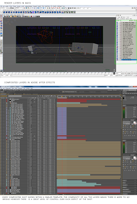
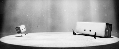 The first shot with both characters together. This was complicated in terms of creating a working light set up within Maya. The number of render layers have also been doubled.
Shot 15:
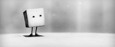 Shot 17:
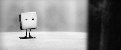 To create a sense of depth with this over the shoulder shot, I applied the 'Lens Blur' filter within After Effects to the Splay layer. The amount of blur will be toned down slightly.
Shot 18:
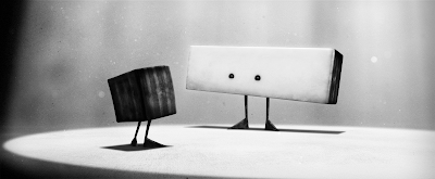 Shot 20:
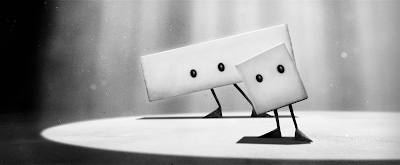
I think some adjustment with contrast will need to be made, as in some shots, it appears as if there is a wall of rock surrounding the characters rather than the rays of light. I am also slightly concerned that the style looks more two dimensional based than three dimensional. I may be wrong. It will be easier to see how this works once every file been exported as a movie file from Adobe After Effects. This will be a time consuming process this week, so the sooner I start doing this the better.
Shot 13:
 The first shot with both characters together. This was complicated in terms of creating a working light set up within Maya. The number of render layers have also been doubled.
(Light setup, render layers and After Effects composite)
Shot 15:
 Shot 17:
 To create a sense of depth with this over the shoulder shot, I applied the 'Lens Blur' filter within After Effects to the Splay layer. The amount of blur will be toned down slightly.
Shot 18:
 Shot 20:
I think some adjustment with contrast will need to be made, as in some shots, it appears as if there is a wall of rock surrounding the characters rather than the rays of light. I am also slightly concerned that the style looks more two dimensional based than three dimensional. I may be wrong. It will be easier to see how this works once every file been exported as a movie file from Adobe After Effects. This will be a time consuming process this week, so the sooner I start doing this the better.
Friday, 21 May 2010
The compositing work continues:
Shot 7:
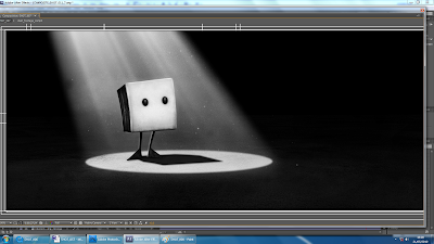
Phil suggested that I add a rim light to Squ's back and feet. I quickly added a rim light to him in Maya, then rendered a single frame to see how this would composite. This has definitely helped give the character more definition. However Squ still does not fit into the scene properly. I will decrease the curve values on his body, so that he is less bright. The light is behind him, so his texture would be in shadow and only some light from the floor would bounce onto his face.
Shot 8:
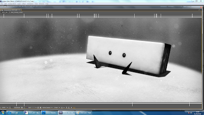 Shot 9:
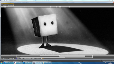 Shot 11:
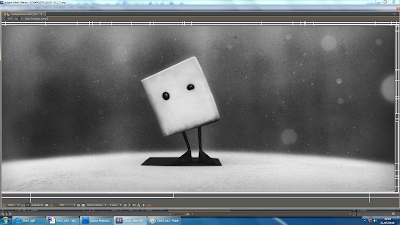 The amounts of dust floating in the air in this shot will also be decreased, as at the moment it is too distracting.
Shot 14:
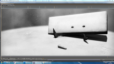
It has been a challenge to get these composites as consistent as possible, which is why I have created one master file within After Effects, so that I can swap between files and make minor adjustments in adjustment layers and values such as curves and opacity. Naturally, these stills can be improved. At the moment there is way too much grey, and not enough black and white as in the concepts.
Shot 7:

Phil suggested that I add a rim light to Squ's back and feet. I quickly added a rim light to him in Maya, then rendered a single frame to see how this would composite. This has definitely helped give the character more definition. However Squ still does not fit into the scene properly. I will decrease the curve values on his body, so that he is less bright. The light is behind him, so his texture would be in shadow and only some light from the floor would bounce onto his face.
Shot 8:
 Shot 9:
 Shot 11:
 The amounts of dust floating in the air in this shot will also be decreased, as at the moment it is too distracting.
Shot 14:

It has been a challenge to get these composites as consistent as possible, which is why I have created one master file within After Effects, so that I can swap between files and make minor adjustments in adjustment layers and values such as curves and opacity. Naturally, these stills can be improved. At the moment there is way too much grey, and not enough black and white as in the concepts.
Wednesday, 19 May 2010
Tuesday, 18 May 2010
Wednesday, 12 May 2010
Production is now in full swing, with Phil powering his way through animation. These shots are then passed over to me to light, render, composite and finally export into movie files.
I have now attempted to composite three shots over the past week, getting used the Maya to After Effects workflow as I go along.
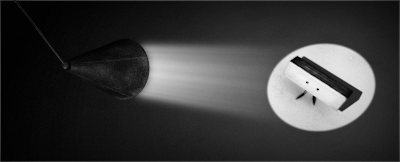
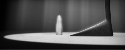
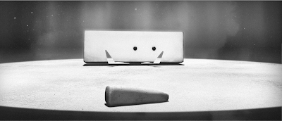
I am fairly happy with these initial composites, it is definitely a step in the right direction.
I have now attempted to composite three shots over the past week, getting used the Maya to After Effects workflow as I go along.


I am fairly happy with these initial composites, it is definitely a step in the right direction.
Subscribe to:
Comments (Atom)
