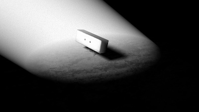
Simpilicity has always been the key for achieving the correct look of the visuals in SPLAY, so no detail can be overlooked, especially when so many shots of the film will only consist of a character, a spotlight and an illuminated floor.
I have been responsible for creating most of the textures (however few there are) and also the lighting. When I look back its incredible to think that we were going to use a colour palette of bronze and golden browns - the complete opposite to what it is now. It was fortunate for us that when Fraser McLean came to present a lecture in colour and layout theory that he commented on the striking monochromes. Dan Dalli had also mentioned in the second year that no student film from Ravensbourne had been made in black and white, so this provided even more of an incentive to create something different.
I was inspired by Phil's original concept that he presented at the pitch in September, and I thought the film should have always looked like that, but it is only now that the story is grittier in tone that we can go can back to the black and white. I have been creating a few tests within Maya and then compositing these with Adobe After Effects, as shown below:

However much I tried to meet Phil's vision, I still felt there was something not right. For instance, the textures of the ground did not suit the environment, and there was not enough contrast overall. I referred back to the original concept again and argued that there should only be black and white, with very little grey as possible. Phil agreed, and also suggested that the textures of the environment should be the same as the characters, i.e very soft and chalky.
You could say that all this work has been wasted, because we have worked ourselves back to the very beginning, well I don't think so. Without that process we could have made any other wrong decisions and at the end of the day its all part of the fun.
I have now attempted to recreate the concept in Maya:

And now importing Squ into the scene:


