We have now reached the deadline, and everything is handed in. So now some time to reflect back on this year.
At the beginning of the first term I was unsure of what I wanted to do after I left university. I was always interested in working in some form within the film industry, but I could not identify what that was. I was initially asked to work on SPLAY and Polished Off to assist in the lighting and compositing aspects of the production, but these were areas that I was never entirely confident in doing. My contribution to these projects progressed throughout the year, so too had my confidence in my lighting skills.
It has been a thoroughly enjoyable experience working within the group, especially with such focussed and supportive individuals. Everyone has their niche, whether it be in animation or texturing or telling a good story. The directors have been determined to get the best they can out of their films, and their determination has given me the drive to do the best I possibly can. In addition, working on someone else's project, and not my own has prepared me slightly more for what's out there in the real world.
Lighting is my specialist area, yet I have also found a keen interest in creating textures and compositing.
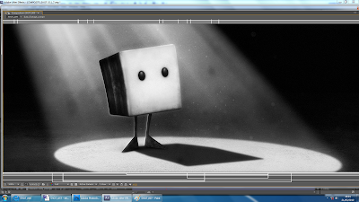
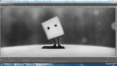
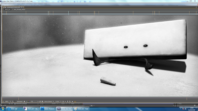
I am very pleased with the way the films look. It was refreshing to finally see 8 months of work finally pieced together. It is only then you fully appreciate what it was all worth working for.
SPLAY, is as of yet, incomplete. Yes, we have created over two minutes of footage, but this is only a small section of the film. I am incredibly proud of the work that we have put into the film this term. Remember that in term 2, production on SPLAY was almost stagnant, so we have definitely turned this around, and pushed ourselves these past few weeks to get the sequence made.
It may be the end of the degree, but the show must go on. We will continue to work on the film after the degree, until it is complete. We may be way out of our depth, but nothing is worth working towards if it is going to be easy. I know we are more than capable of completing a potentially great film.
Friday, 28 May 2010
Monday, 24 May 2010
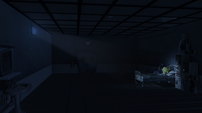
With only 4 days until the deadline, its a coincidence that I should be working on Shot 4 of Polished Off. This is a long shot of the entire hospital room, before Jed enters. In terms of lighting, everything is in darkness, apart from Ed, illuminated by the beam of moonlight through the opposite window. This shot took me a couple of hours to complete, and thankfully I used a reference from previous night lighting work on the film.
Final
The only alterations that need to be made are to include the lights on the machine, and with an animated pump.
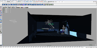
The light set up within Maya
Final

The only alterations that need to be made are to include the lights on the machine, and with an animated pump.
The light set up within Maya

Sunday, 23 May 2010
It was my aim this weekend to get as many of the remaining shots composited, so that the rest of the week could be devoted to making minor tweaks and concentrating on getting the hand in folders put together for marking. I was very pleased with my progress this weekend. Here are the completed stills:
Shot 13:
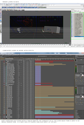
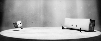 The first shot with both characters together. This was complicated in terms of creating a working light set up within Maya. The number of render layers have also been doubled.
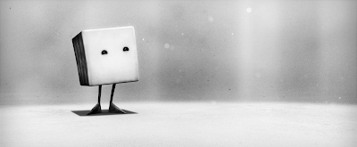
Shot 15:
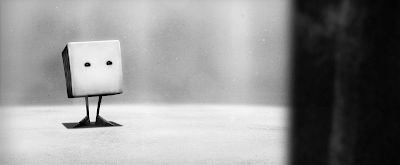
 Shot 17:
 To create a sense of depth with this over the shoulder shot, I applied the 'Lens Blur' filter within After Effects to the Splay layer. The amount of blur will be toned down slightly.
Shot 18:
 Shot 20:
I think some adjustment with contrast will need to be made, as in some shots, it appears as if there is a wall of rock surrounding the characters rather than the rays of light. I am also slightly concerned that the style looks more two dimensional based than three dimensional. I may be wrong. It will be easier to see how this works once every file been exported as a movie file from Adobe After Effects. This will be a time consuming process this week, so the sooner I start doing this the better.
Shot 13:
 The first shot with both characters together. This was complicated in terms of creating a working light set up within Maya. The number of render layers have also been doubled.
(Light setup, render layers and After Effects composite)
Shot 15:
 Shot 17:
 To create a sense of depth with this over the shoulder shot, I applied the 'Lens Blur' filter within After Effects to the Splay layer. The amount of blur will be toned down slightly.
Shot 18:
 Shot 20:
I think some adjustment with contrast will need to be made, as in some shots, it appears as if there is a wall of rock surrounding the characters rather than the rays of light. I am also slightly concerned that the style looks more two dimensional based than three dimensional. I may be wrong. It will be easier to see how this works once every file been exported as a movie file from Adobe After Effects. This will be a time consuming process this week, so the sooner I start doing this the better.
Friday, 21 May 2010
The compositing work continues:
Shot 7:
Phil suggested that I add a rim light to Squ's back and feet. I quickly added a rim light to him in Maya, then rendered a single frame to see how this would composite. This has definitely helped give the character more definition. However Squ still does not fit into the scene properly. I will decrease the curve values on his body, so that he is less bright. The light is behind him, so his texture would be in shadow and only some light from the floor would bounce onto his face.
Shot 8:
 Shot 9:
 Shot 11:
 The amounts of dust floating in the air in this shot will also be decreased, as at the moment it is too distracting.
Shot 14:
It has been a challenge to get these composites as consistent as possible, which is why I have created one master file within After Effects, so that I can swap between files and make minor adjustments in adjustment layers and values such as curves and opacity. Naturally, these stills can be improved. At the moment there is way too much grey, and not enough black and white as in the concepts.
Shot 7:

Phil suggested that I add a rim light to Squ's back and feet. I quickly added a rim light to him in Maya, then rendered a single frame to see how this would composite. This has definitely helped give the character more definition. However Squ still does not fit into the scene properly. I will decrease the curve values on his body, so that he is less bright. The light is behind him, so his texture would be in shadow and only some light from the floor would bounce onto his face.
Shot 8:
 Shot 9:
 Shot 11:
 The amounts of dust floating in the air in this shot will also be decreased, as at the moment it is too distracting.
Shot 14:

It has been a challenge to get these composites as consistent as possible, which is why I have created one master file within After Effects, so that I can swap between files and make minor adjustments in adjustment layers and values such as curves and opacity. Naturally, these stills can be improved. At the moment there is way too much grey, and not enough black and white as in the concepts.
Wednesday, 19 May 2010

Tuesday, 18 May 2010


Wednesday, 12 May 2010
Production is now in full swing, with Phil powering his way through animation. These shots are then passed over to me to light, render, composite and finally export into movie files.
I have now attempted to composite three shots over the past week, getting used the Maya to After Effects workflow as I go along.
I am fairly happy with these initial composites, it is definitely a step in the right direction.
I have now attempted to composite three shots over the past week, getting used the Maya to After Effects workflow as I go along.


I am fairly happy with these initial composites, it is definitely a step in the right direction.
Monday, 10 May 2010
Jed has been without a finalised texture for his afro for quite some time. Now it had come to the point where shots of Jed within the environment had to be rendered, so Dan Edgley asked me to create something that didn't look painted (without the dappled patches of hair in the previous texture I created)

And now applied to Jed - in all his textured glory.


And now applied to Jed - in all his textured glory.

Friday, 7 May 2010
Lost is undoubtedly one of my favourite TV shows. It has been consistent since the beginning in keeping me gripped to my seat. Much of this has been due to its mysterious quality, and vast exploration of ideas and themes. At times it may be overly complicated to follow, with several stories entwined at once, but it is a rewarding experience if you persist with it.
Titles
A floating white logo emerges from darkness, out of focus. It is only when it draws closer to us, that the letters become crisper, but only for a split second until it flies past the camera, disappearing once again into the void.

The opening title sequence for Lost is a visual metaphor for the entire show. It informs the audience of everything it needs to know - a mystery that is seemingly transparent will be quickly replaced by the next unanswerable question. The simplicity of the lettering and the contrast of the black and white are particularly striking, also reminding the audience of the show's prominent theme of good and evil.
Friday, 30 April 2010

Thursday, 29 April 2010
The light set up which I created for the entire hospital room hasalso been applied to shot 28, when Jed walks past the mirror, completely oblivious to Ed's frantic reflection in the background. This was a fairly simple process, as everything required for this shot had already been textured and imported into the scene file. The area lights have provided most of the fill here, yet I have have had to incorporate two more point lights in order to provide some bounce on the sink and under the shelf as there was too much shadowing. I also slightly amended Simon's original textures of the sink and mirror to blend in more with the environment. The colours are softer and this will make Jed stand out even more when he walks past:

Im particularly pleased with how the finger marks look on the mirror's surface. More colour adjustment to textures for the wall and the props with the scene:

The final still (apart from the character as Simon will be responsible for lighting this.) As this will only be a close up shot, I also amended the texture of the wall as before it was too pixilated and blurry in areas.

The light set up itself:

Wednesday, 28 April 2010
I have been continuing to work on Polished Off these past few weeks, but not to the same degree as term 1 and 2. My main responsibility this term for Polished Off, has been to create a light set up for the entire hospital room. Being only one environment, it was even more important that I get the lighting correct, as it would be seen in a mulititude of shots throughout the film. Ideally, this should have been done during term 2, but we had no completed scene file of the room, and there was still a way to go until textures were finalised and the rigs of the characters were completed and scaled correctly in proportion to the environment.
Dan Edgley had put together a scene file with all objects imported. I recreated the the floor and wall tiles - giving them more definition, as well as adding details such as pipework on the walls.
Light setup:

I cannot justify having such an immense number of lights (18 in total) yet this doesn't affect render time drastically, as we will not be rendering using Global Illumination or have every light casting shadows. This is probably not the correct workflow, yet it has given the right results.
Initial render

Update

Final
 In order to achieve the 'soft' look which Dan Edgley was aiming for, it was necessary to increase the number of lights which cast shadows, and also alter attributes on textures (such as diffuse, specular etc.) and the textures themselves. I should also add that I textured most of the environment (apart from the props) as shown below:

The light set up will apply to many shots in Polished Off, and Simon Harvey will be responsible for making tweaks with the lighting for each individual shot.
Dan Edgley had put together a scene file with all objects imported. I recreated the the floor and wall tiles - giving them more definition, as well as adding details such as pipework on the walls.
Light setup:

I cannot justify having such an immense number of lights (18 in total) yet this doesn't affect render time drastically, as we will not be rendering using Global Illumination or have every light casting shadows. This is probably not the correct workflow, yet it has given the right results.
Initial render

Update

Final
 In order to achieve the 'soft' look which Dan Edgley was aiming for, it was necessary to increase the number of lights which cast shadows, and also alter attributes on textures (such as diffuse, specular etc.) and the textures themselves. I should also add that I textured most of the environment (apart from the props) as shown below:
The light set up will apply to many shots in Polished Off, and Simon Harvey will be responsible for making tweaks with the lighting for each individual shot.
Sunday, 25 April 2010
I had made an entry in my journal last September after seeing Pixar Studios latest feature UP at the cinema. I described how much it had inspired me to push the quality of my work in this final year.
In the following weeks, I found myself going back through the list of Pixar's other films, each with their own different qualities. Watching these films with a fresh pair of eyes only greatened my appreciation for the animation medium.
Animation has the ability to affect people in ways in which a live action film necessarily could not. I cannot recall ever seeing a film that has made me laugh in one instance and then in the next struggle to hold back a tear or two. UP opens to the mishaps and adventures of the young Carl Fredrickson, not long after leading into a montage sequence of his entire life over a matter of minutes. These films are created for a family audience, yet deal with universal themes, which makes it accessible to anyone.
Visually speaking, Pixar films are simply incredible to look at. They have once more raised the threshold in the realism of their imagery. Aspects such as texturing and lighting in particular are far more photorealistic, yet this does not impede on the animated visual style. As I have been heavily involved in the lighting and texturing stages of production on Polished Off and SPLAY, it has become a routine for me to look back at stills from the film as inspiration. Especially the following images (for both night and day light setups)


I would be a fool to even think I could reach that level of quality, but I think it has been important to set myself a target, even if it may be an unrealistic one. This has definitely been a large driving force this year to get the look of the lighting and the texturing on the films as good as we possibly can.
Friday, 23 April 2010
MK12 is a graphic design company who is best known for creating movie title sequences. When I was browsing through their work I came across a short video of theirs, called 'Embryo':
There is no apparent meaning to this video, but the combination of intrusive razor sharp breathing and disjointed camera movements is interesting. I liked the video for the purposes of style and sound. Also, when you see the mouse close up, you can see dust flying around, as it's being caught by the light - you get a sense that the air is filthy.
There is no apparent meaning to this video, but the combination of intrusive razor sharp breathing and disjointed camera movements is interesting. I liked the video for the purposes of style and sound. Also, when you see the mouse close up, you can see dust flying around, as it's being caught by the light - you get a sense that the air is filthy.
Friday, 16 April 2010
…music can do much more than echo the action on the screen. It can evoke hidden lives, unknown destinies, unseen histories, forgotten voices.
Alex Ross, The Rest is Noise.
I wanted to devote some time on my blog to the subject of music, as it will play such an integral role in driving the story of SPLAY.
The team first discussed the style of music during the first term, as we were working on the animatic for the pitch. I knew that Phil had wanted each character to have their own accompanying instrument, such as the plucking of violin strings for the Boids. But when it came to thinking of an instrument to represent Splay, it had to be a piano. Piano tunes can be very melancholic and it would be fitting for a lonely, melancholic character.
For the animatic, I used a selection from Tchaikovsky's Piano Concerto No.1 - which worked surprisingly well: (5:55). There are other sections of the piece where the piano is quite comical in tone, and would be ideal for the sections where Splay follows Squ and the Boids up to the house.
Claude Debussy's Clair De Lune was also an inspiration.
We had wanted to have an orchestral sound track, which would be bold and theatrical, and set to the visuals, such as in Disney's Fantasia (1940):
However when we had a story discussion with Tom Hooper, he argued that this would not reflect the harsh, industrial feel of the world and instead it would soften the image. He advised that we should not remain in a comfort zone and experiment with using sharp, mechanical, inorganic sounds, rather than it being directly musical - the sounds would be the music in effect. It was an interesting concept and one that we warmed to.
The advert shown in the video above is taking Tom's suggestion quite literally, however the piece of music is still orchestral based.
The composer Michael Giacchino achieved some of the sounds for his scores on the TV series Lost by using unusual instruments, such as striking suspended pieces of a plane's fuselage. He also combined these eerie array of sounds with orchestral music, adding increasing menace and suspense to the visuals.
Roque Baños used a theremin in his score for The Machinist (2004). This electronic instrument has a somewhat bizarre and unearthly sound to it:
The electronic band Depeche Mode sampled household items in their song Blasphemous Rumours (1984) such as hitting suitcases with metal poles and throwing saucepans down a flight of stairs. I think this proves that music can be created in any way, however destructive the process!
And I've put this in for the hell of it:
These are but a few sources of inspiration for me, but of course we would like something original to be made for the film. Paul Avon is a close friend of mine and he will be composing the music. I have had several discussions with him regarding SPLAY. He uses a variety of creative audio software and will be implementing a software plug-in called 'Dark Skies' which is specifically for creating cinematic ambiences, soundscapes and effects. Here are a few demos from the creator's website:
http://www.zero-g.co.uk/media/mp3/5/e/DS_Ambience_Example5.mp3
http://www.zero-g.co.uk/media/mp3/p/q/Dark_Skies_Demo_ShockHorror.mp3
http://www.zero-g.co.uk/media/mp3/5/r/Dark_Skies_Demo_Stingers.mp3
Some of these sounds are quite extreme, and probably more suited for the science fiction genre, however it has potential. The 'colossal warehouse' that Phil describes is very much what Paul is aiming for and so too is that industrial, mechanical edge. I will update the progress of the music in the up and coming weeks.
Thursday, 15 April 2010
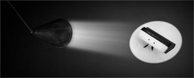
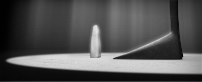
One particular technique we intend to use in our films is Depth of Field (DoF). This will be incredibly useful in adding depth to shots, as otherwise elements such as characters or objects can look very flat against a backdrop. The use of DoF will be slightly different for both films, because of the differences in environment and style.
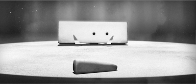
In order to create DoF, Maya has an in-built option which you can apply to the camera. After Alec had made a few tests using this a few months ago, it was apparent that the quality was not particularly great and there was not much flexibility with the settings. An alternative is to apply a Luminance Depth render pass. I have made a quick test to demonstrate how Luminance Depth works.
 (Colour)
 (Luminance Depth. White = close. Black = far)
 (screen shot of layers in Adobe After Effects)
When importing both renders into Adobe After Effects, I placed the depth render underneath the colour render, applying a Lens Blur filter to this. This filter allows you to attribute an image as a Depth Map Layer (i.e the imported render) and the Blur Focal Distance setting determines how blurred the layer is, thus giving far more control. Here is the final composite:

This is a very basic demonstration of what Luminance Depth can achieve - the cone in the foreground is now distinctive from everything else. This level of control will enable us to be far more selective of how much DoF is used within a shot, although it is important not to get too carried away and over use the technique. It should only be applied for the purposes of aiding the composition and story.
In order to create DoF, Maya has an in-built option which you can apply to the camera. After Alec had made a few tests using this a few months ago, it was apparent that the quality was not particularly great and there was not much flexibility with the settings. An alternative is to apply a Luminance Depth render pass. I have made a quick test to demonstrate how Luminance Depth works.
 (Colour)
 (Luminance Depth. White = close. Black = far)
 (screen shot of layers in Adobe After Effects)
This is a very basic demonstration of what Luminance Depth can achieve - the cone in the foreground is now distinctive from everything else. This level of control will enable us to be far more selective of how much DoF is used within a shot, although it is important not to get too carried away and over use the technique. It should only be applied for the purposes of aiding the composition and story.
Tuesday, 13 April 2010


Monday, 12 April 2010
After a chat with Dan Dalli and a moment of madness, I took the decision to work solely on Polished Off, as I was concerned about the amount of shots that had to be lit and composited. I knew I would not be able to do all of this for both projects, so we agreed that Simon would be responsible for the lighting and compositing on SPLAY. But soon after this decision had been made I regretted it, as this was not where my main interests lie. I had committed a lot of time to helping Phil develop the story and I wanted to see this through to the end result. Phil also felt that it was only him working on the project. It is only fair that I should contribute my time fully to SPLAY but at the same time supervising Simon on Polished Off.
Saturday, 10 April 2010
Update on Shot 9.
To accommodate the foot within the frame, the camera has had to be pulled back. The foot is raised very high when Jed taps, so it was important that the following render would look exactly the same as the previous version of Shot 9 but that no animation was cut off:

The light set up within Maya:


The light set up within Maya:

Wednesday, 7 April 2010
Update on Shot 6.
Update 1
 Improvements made:
 Improvements Made:
 Improvements Made:

Update 1
 Improvements made:
- Adjusted the hue of the blue.
- Turned off shadows from a fill light as only the key light from the window should be casting shadows.
- Increased the light radius in the Raytracing settings to soften shadows.
- Lowered diffuse on wall texture, so there is less light spread, more emphasis on Ed.
- Scaled floor tiles.
- Changed textures on bed cover and wall tiles.
- Imported cabinet props.
- Test glows of machine dials.
- Used HDRI to give reflected details.
Update 2
 Improvements Made:
- Focus length of camera altered, zoomed in, composition changed so that Ed's head isn't cut off by bed.
- Less light spread on wall. Intensity of key light on Ed increased.
- Imported chair prop and light linked.
Update 3
 Improvements Made:
- Position of chair.
- Blues slightly desaturated, more natural.
- Less diffused light on machine to blend in with scene.
- Diffuse and light linking altered on bed sheet and duvet.

Tuesday, 6 April 2010
My next task to light Shot 6 for for Polished Off. This is long shot of Ed sleeping. Here is my initial lighting test:

This is quite simply a terrible first attempt and much work needs to be done. There are many attributes on textures that will have to be adjusted and also a case of being more thorough with light linking objects. The shot requires that moonlight will be shining through the window and illuminating Ed, and the moment there is too much diffused light on the wall behind the character. I will also import props such as the cabinet and chair.

This is quite simply a terrible first attempt and much work needs to be done. There are many attributes on textures that will have to be adjusted and also a case of being more thorough with light linking objects. The shot requires that moonlight will be shining through the window and illuminating Ed, and the moment there is too much diffused light on the wall behind the character. I will also import props such as the cabinet and chair.
Subscribe to:
Comments (Atom)